

Tutorial 19
Fine-Tuning the properties of a chart
This tutorial demonstrates the finer tuning of the properties of a chart to alter their appearance away from the normal looking charts. Using these chart properties, you need never have to send out plain looking reporting charts ever again.
For the purposes of the tutorial we will open our previously saved Query called ‘Tutorial18′. We will do the fine-tuning on this tutorial to change our charts to different styles, marks, colors, titles/footers, panels and fonts.
Perform the following steps:
- If the Query Designer Tool is already running, please close it down. Invoke the NuVu Query Designer from the NuVu Query program group from the windows Start menu. The main NuVu Query Designer window will be displayed, and a welcome dialog window will also be displayed that shows recently saved/opened queries. We are going to create a new query from the previous query (tutorial18), so double-click on the ‘tutorial18′ item that should be displayed inside the Welcome dialog window (if you have successfully performed the previous tutorial and saved it as specified in that tutorial with a name of‘tutorial18′). The original query will open inside the Designer. We need to now save this as ‘tutorial19′ before we start working with the query, so click on the File->Save As menu item and advise a new Query name of tutorial19 when the save properties are displayed.Click the
 button to save the query with the new advised name.
 - Click the
 button to execute of the query. The results should then be displayed in the grid.
 - We will now click the
 to chart the grid results. The chart dialog window will open and display the pie chart that was previously defined:
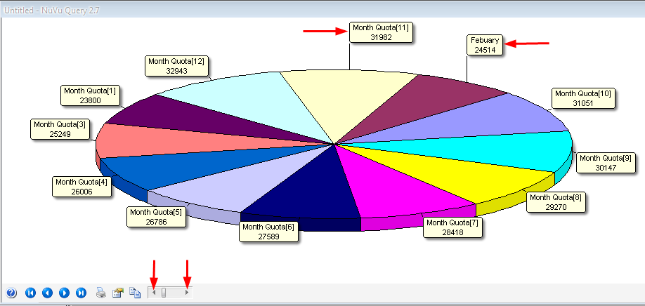
- Click on the
 button to open the ‘Chart Properties’ dialog window. This window will allow us to make all the changes we require to beautify our charts.
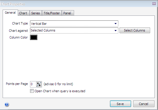
- By clicking the drop down box on the Chart Type field, the type of chart can be selected. For the purposes of this tutorial we will choose ‘Vertical Bar’.
- We will now select the ‘Chart’ tab.
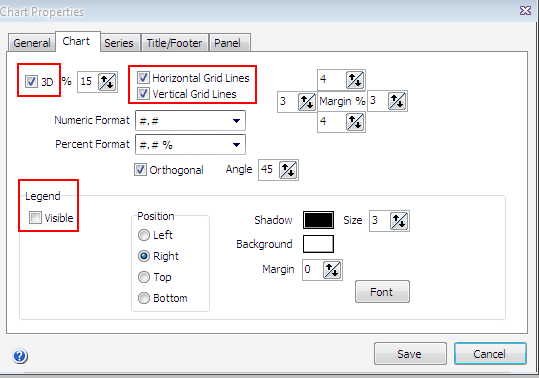
- Firstly for the purposes of this tutorial we will tick the “3D’ block. If you do not want your chart to show in ’3D’ then leave this tickbox unticked.Normally charts are displayed with horizontal and vertical tick marks behind the bars, but for this tutorial we are going to un-tick the ‘Horizontal Grid Line’ and ‘Vertical Grid lines’ boxes. We will also remove the tick from the ‘Visible’ legend which results in no legend being shown on the chart at all. It is purely your choice if you require the ‘Legend’ to show or not.
- We will now select the ‘Series’ tab.
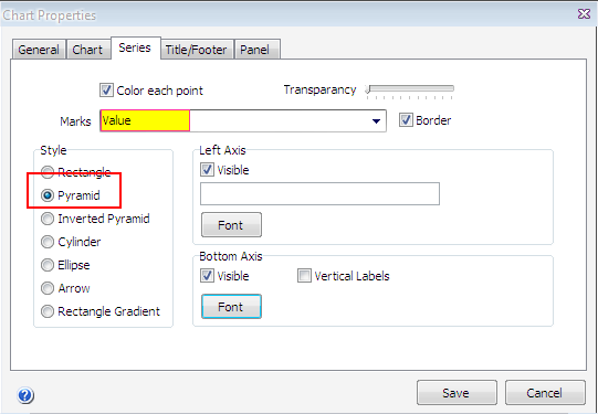
- We will leave the ‘Color each point’ ticked for the purposes of this tutorial, however un-ticking this box will result in each element of the chart showing in the same color (the color that was advised on the first tab of the chart properties window).We will now make changes to the ‘Marks’ property (this property affects each element of the chart, in that a mark is shown against each element). Click on the drop down box on the right hand side to present a list of available ‘Marks’ that can be chosen for your chart. For the purposes of this tutorial we will select ‘Value’.The next change we will make is the ‘Style’, there are a number of Style’s that can be chosen. For this tutorial, we will select the ‘Pyramid’ style.
- We will now select the ‘Title/Footer’ tab.
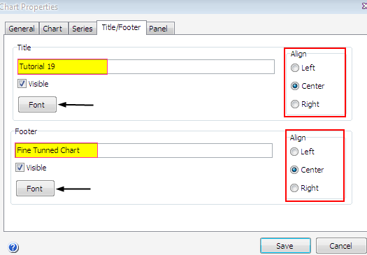
- A ‘Title’ can be added here for the naming of your chart. A ‘Footer’ may also be added to the bottom of the chart. If you do not want your ‘Title/Footer’ to show, simply un-tick the ‘Visible’ tickbox just below the ‘Title/Footer’ box.For this tutorial we will tick the ‘Visible’ tickbox fields for both the Title and Footer. Also we will advise a ‘Title’ of Tutorial 19, selecting blue as the color, and will also advise a ‘Footer’ of Fine Tuned Chart with a color of red.On the right hand side of ‘Title/Footer’ boxes, the ‘Title/Footer’ can be aligned by clicking on either ‘Left, Center or Right’. For this tutorial we will keep our ‘Title/Footer’ in the ‘Center’. The font can be changed to any valid ‘Font Name’, ‘Style’, ‘Size’ or ‘Color’ by clicking on the ‘Font’ buttons. This will open a standard font dialog with a list for you to choose from.
- We will now select the ‘Panel’ tab.
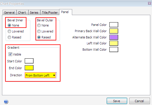
- The ‘Bevel’ options can be used to alter the look of the entire panel. For the purposes of this tutorial we will choose ‘Bevel Inner’ as ‘None’ and for ‘Bevel Outer’ as ‘Raised’, but feel free to play with these settings until the desired result is obtained.Panel colors may also be changed. On the right hand side of the dialog there are different options that can be used as you require. By selecting the different options on the right hand side, the color of the chart can be change to suit your requirements. The ‘Primary’ and ‘Alternate’ back panel color boxes can be used to give a pleasing striped look to the panel.The ‘Gradient’ option gives the chart background a fading color look. To enable this tick the ‘Visible’ box, and then advise the appropriate start and ending color to apply to the gradient. The ‘Gradient’ option also has a ‘Direction’ box to select from, by simply clicking the down arrow button on the right hand side. This will give you a selection to choose from.
- Click on the
 button to save the ‘Chart Properties’ chart. The chart will open and displaying all the changes that have been made.
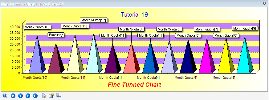
We are complete with the tutorial. An exported query containing this tutorial is available by right-clicking here and choosing Save Link As (Firefox) or Save Target As (Internet Explorer) to save the query import format file to a file on your hard disk, and then importing that query into the query tool (hint: choose File->Import Query from the main menu of the Query Designer).
End of Tutorial